ALWAYS Look Fashionable When You're Struck By Lightening, Playing Croquet.

At the last minute I decided I would participate in yet one more of Threadless's Fall Selection Challenges. It was to design a pattern for either a Men's Button Down Dress/Casual Dress Shirt and a Women's Summer/Sun Dress.

[SKULLYWAGS. Design by TenTimesKarma]
I was just casually going through the submissions for that challenge when I saw this REALLY NEAT and COLORFUL Skull pattern. I was So Hypnotized my it's beauty and simplicity that it inspired me to create a pattern myself and see if I could apply it to the Fall Selection. Alas, I must confess I think the end results were not as inspired as the beginning concepts that guided them, but with less than a week to produce, display and submit them.... I didn't do too terribly bad.

I ended up with two patterns. One I used for a Men's shirt, the other for a Women's dress.

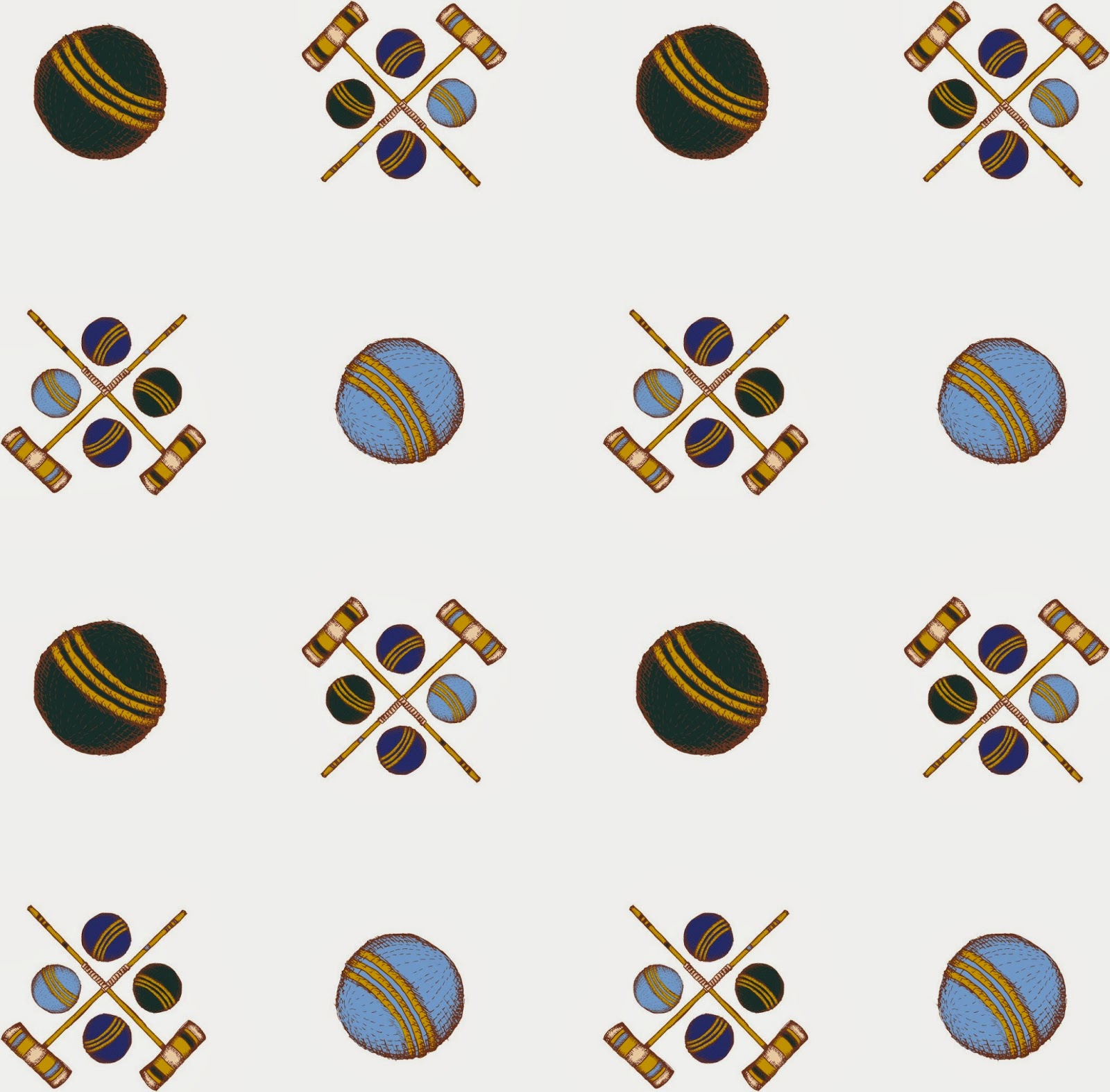
First is the Ole Ball and Mallet, obviously a nod to the old phrase,"Old Ball and Chain." I pattern about relationships. I think that people have a strange kindred spirit with the clothes they choose to purchase and wear. The word "style" I don't feel quite describes it. Why do we gravitate towards particular colors or icons? Does it have to do with proximity to the ocean or the moon, as astrology would suggest most of our other behaviors. Does it have to do with when we were born? I wanted to explore this with a pattern as our relationships with objects and other people seem to more likely than not, create patterns.

Again I started with the Inspiration Board Threadless posted for the challenge. Croquette is one of the objects and activities featured in the image. I looked through the other submissions to see if what I was going to do with the subject hadn't already been done. I didn't want to waste time copying someone else' idea.
At first, I wasn't sure how I should approach it visually, I did see that all of the other croquet related submissions were completely drawn in the computer and were very very simple, graphically, and were clean and mainstream (which is completely OK and great. I'm not implying that they were bad submissions. Actually they were amazing designs. I almost decided not to work with croquet at all, they were so good.) My point is that NO ONE had taken the organic and more illustrative approach to a pattern design, like I was wanting to... which was GRRRREAT!
I had very little planning and execution time so I decided to begin with just sketching the basic game equipment directly in ink. I figured that since I wasn't needing mainstream-line-clean, flawed drawing and wonky lines and scratchy mistakes were completely more on the side of perfect for this particular concept. I ended up going with the first thing I sketched out: One Ball and One Mallet.

Relationships with a lover or even with other people involve different degrees of proximity. I literally used this concept to build my aesthetic. I balanced a cluster of elements against a large singular element. Croquet is played in several shades of how proximate the various game equipment is to one another... I thought the very same with Human Relationships.


I'll be absolutely honest, I HATED the choice of fabric color the dresses could be printed on. I'm not sure how much crack the Threadless Designer(s) who made that decision was(were) smoking, but as a good friend of mine would put it, plainly,"It Ain't A-Workin'." So I really went through several color modifications and was truly waffley in the most accurate sense of the word.


I'm still not really pleased with the overall results of this pattern, but went with it due to deadline restrictions... I then needed to create an attractive display for the pattern... I confess again, I was SO VERY tired when I put the first one together. I longed for completion of the project as


I eventually created a better display for the patterns the following day after much needed rest and deliberation. I had previously stayed up for about 2 days in a row, living on 2 hour naps sporadically littered throughout the day and ALOT of 5-Hour Energy Drinks. What was I thinking!?!?!

I had a brilliant Idea of how to "Model" my patterns. I am a huge movie buff and thought it would be fun to use famous classic shots of famous classic stars from a few famous classic films. I would leave everything in Black and White with the exception of my pattern as it would look on the garment. I eventually had to delete the Movie Star images from the display. Apparently even if it's just a preliminary display just for voting, you can't use the copyrighted images. I assumed since it was just for voting, it would be fine. It wasn't going to be published on their site if it was selected for printing, so I don't really see what harm it would have caused. Anyway, you can see the Ole Ball and Mallet it's all it's Hollywood debut glory here, at my sketchblog. As you can see, I also made changes to how I was going to flow the pattern on the fabric as well as changed the Display Title a bit, too.

Relationships are tricky things, and I should have thought about that particular characteristic before making human relationships my inspiration and subject matter for the pattern as it CERTAINLY was very tricky to work with.

The second pattern I put together was Lightening in a bottle, which was an idea pulled from my Idea Journal. It was from an entry over a year old and It was an idea I wanted to create, though I think I may revisit the idea again, in future, as I was also a bit disappointed with the outcome of this one. The basis for the idea was, originally to create an iconic image of Lightening in a bottle balancing both positive and negative space.
 I thought this idea was clever as electricity (lightening) involves the flow of both negative and positive currents. A graphic representation of capturing inspiration itself and the fantasy of being able to possibly bottle it. Here is the jotted doodle/note for myself for future development.
Often this is what my idea journal consists of: little vaguely readable thumbnail drawings attached to a large body of description telling my future self what to do to create it. If you're not already carrying around an idea journal, artists, get one. I like Moleskin, preferably for mine ;0)


After I decided I could no longer work on the pattern, I put together a display also utilizing the same Hollywood Model idea and set my two pattern submissions up like a dyptic. Unfortunately, these patterns did not create much enthusiasm in the competition.


In any case this concludes my most recent adventures into designing for Threadless.com and as par for the course have still not cracked into their clique of printed designers and illustrators. But, I will keep at it I'm sure, here and there submitting something to them to see how it goes. I'm curious to see who actually was printed for this competition as very few people scored high in the voting area.
Until next time
Keep sketching, keep thinking, keep laughing and most important of all, keep making art.
Cheers,
LEWIS

Enjoyed reading about the whole process to create these. Amazing Lewis!
ReplyDelete