Great Design Takes the Cake, and Is Usually Very Tasty or in Good Taste.
You know, the "Fat Boy" inside of me will tell you,"There's NOTHING better in this world than Great Cake." And I would have to agree with him, because it's definitely true. Great Cake is truly Divine. I find it so difficult to put into words the sensation and flavor journey that a good piece of cake can take us.

I would never say it's orgasmic because I don't like to compare food to sex or think of it in a sexual nature. Though it is true that both Sex and Food are part of the pleasures of being alive and there are Scientific studies on how certain foods, like Dark Chocolate for example, release the same chemicals in our brains (therefore equating Sex chemically to certain Food), I refute the idea and am repulsed by the idea of getting "jiggy" with my food. [Insert some humorous reference to the film American Pie here.... Or exclude it] ;0)
I will say that REALLY GOOD Food has the power to transport us if not stop time altogether. I'm certain if you really think about it, there was something you have eaten in your past that, from the very moment it touched your tongue, your brain stopped thinking of anything else. All you could think about was how amazing this flavor was and how you have never experienced anything like it before. You're surrounded by this thought completely and everything else in the outside world has stopped and/or ceased to exist really. You instantly transcend all time and all space. What may be seconds to others surrounding you can be minutes to you. In one single moment you have forgotten Language in it's entirety and the ability to speak. All you can even utter is one solitary single-syllable sound: "Mmmmmmmmmmm."
You just want to Savor this moment this flavor, this sensation, and never come back from it and REALLY GOOD Food has that power over humanity.

This can also be said for REALLY GREAT Design or REALLY GREAT Art (in general.) It also has the power to transcend our minds and spirits. The Inner Fat Boy says,"Really Great Cake," but what it really boils down to is Every Great Sensation in this world has the power to entice, entrap, hypnotize and change us from the inside out.
Now, don't get me wrong. I don't fancy myself to have an over inflated ego and in no way do I feel that I create REALLY GREAT Art, like the sort that changes this World we live in. Those are the Artists that make it into the history books. Statistics say that only a very small percentage of all living artists, today, will achieve that in their lifetime.
 And the majority of us are Really OK with that because our goal is not to be famous (especially posthumously... Eeek!) but a need to express ourselves through our chosen medium. Now, I do feel I create REALLY GOOD Art that I base in solid conceptual ideas. I'm usually very pleased and excited with the outcome of my projects.
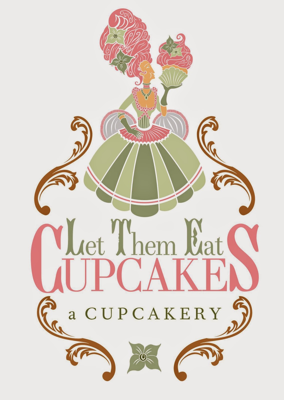
Last year I created a company logo and brand for a Cupcake Bakery in Macon, Georgia called Let Them Eat Cupcakes. I was contacted by the owner of the Cupcakery (as they call it in the 'biz'.) She had seen some previous work I had done for another client and asked me to design something for her company. Aside from feeling flattered (as I always am by the way) it always is cool to know what other work got you the next gig. Most of the time you never know what brings clients your way, but every now and again, you get to find out... And that's a really interesting fun feeling that I can't quite find words to describe.

Anyway, after speaking with my new client, I learned more about the Cupcakery and how she wanted it to be represented out in the world. The Business name is an obvious reference to the supposed "slight" by then Queen of France, Marie Antoinette, to the poor and hungry peoples of France. It was said that when confronted with the plight of her people she indifferently made the aloof comment,"Let Them Eat Cake." Historians mostly agree that she had never spoken those words. They were published by the Revolutionaries to insight hatred and fan the flames of hatred toward the monarchy, eventually causing their downfall with the Revolution itself.... As we all know.


I had a lot of fun developing the initial concepts for this brand. Some ideas played with the visuals of the infamous monarch and also symbols of the monarchy, in general. I also had fun "playing the other side," so to speak, and creating ideas that were from the point of view of the French Revolutionaries. My client and I also discussed the idea of a beheaded cupcake as the branding image, which was a really fun and darkly playful idea that I loved. Of all the concepts, my client resonated with the idea of playing with Silhouette and creating a very strong associative icon. I think it turned out quite well and I'm excited to share a bit of the story behind it with you in this post.
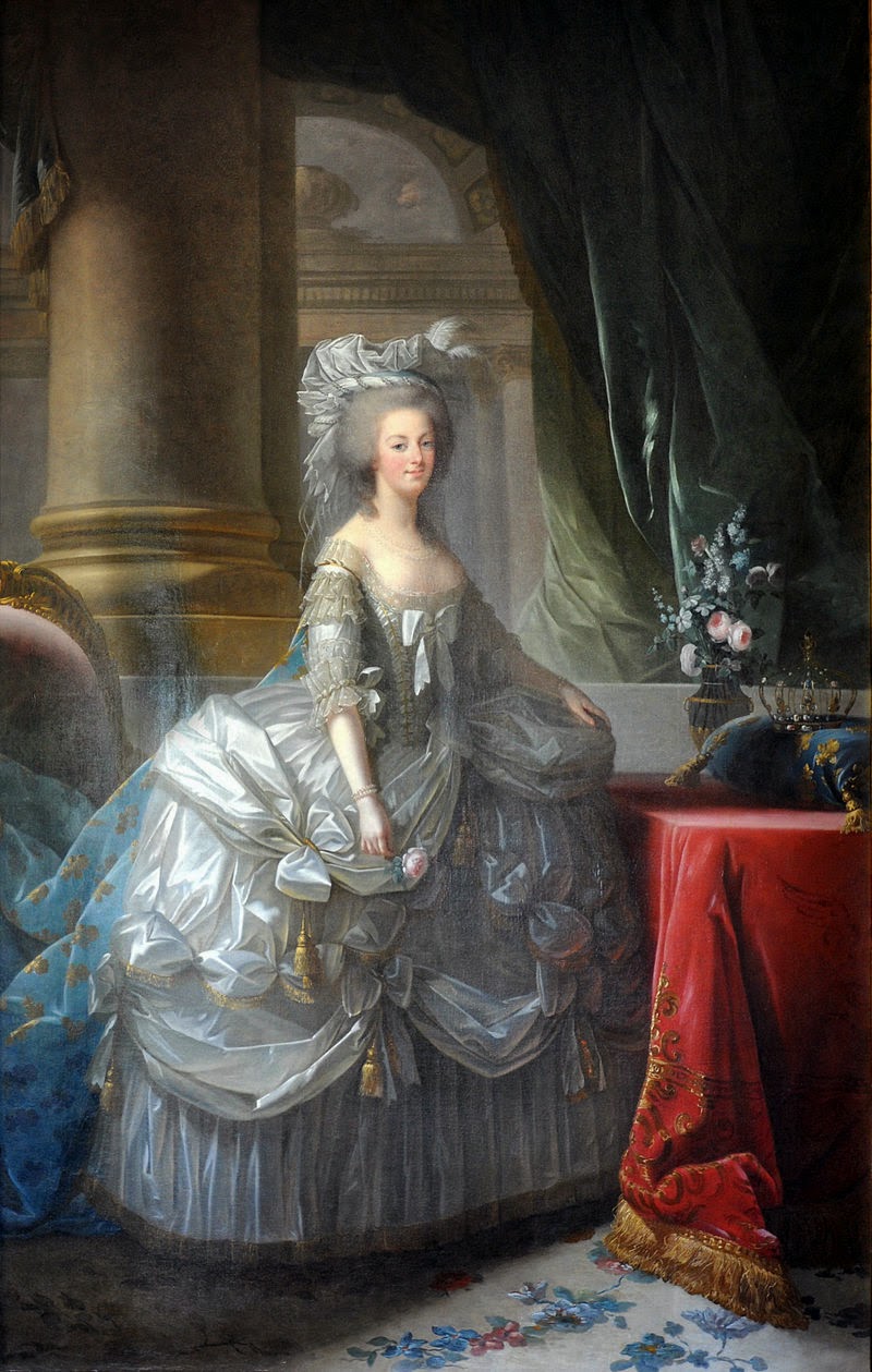
After the initial decision of the direction we were going to go with this logo was made, I began sketching ideas of how to blend visually Cupcakes and Monarchy; Pastries and Politics. As per usual, I start researching my two main ingredients, my two core subjects that will eventually come together in unison: Queen Marie Antoinette and Cupcakes. Marie Antoinette was Queen of France from 1774 to 1792. I won't give you all a history lesson in her life, but those years are key to how I handled some of the visual design decisions for this logo. If you do want to learn more about the Queen, and I would encourage you to as her life was very fascinating, just click on her photo Above and it will link to the Wikipedia Article about her. She was living through the time of the French Rococo Art period. Though it's height was peaked in the 1730s in Paris, it still was very influential and in-style in the Versailles Palace at the time of Antoinette's reign. So I made a conscious effort to include a nod to that artistic time period within the parameters of this business identity.
Ultimately the goal is to create an intriguing visual brand for the business. So that is obviously my primary goal, as her designer. However, the illustrator in me is saying that it is going to be visually important to include artistic details from this art period as the business name and the monarch it references are so very specific to a particular location and period of time in History.
My research also included a search to see if the branding concept we were going to use had been used by any other bakery. I did discover that there were a few cupcakeries that shared the same name and only one of the used the image of Antoinette.
 It was only a bust and the head was generic as well as the costuming (no research on the period I assumed. Also I am wondering if bits of it were not found on stock-art sites.) The focus for that company's branding seemed to be the hair being made to simulate or, in fact, is transformed into a cupcake. Luckily my specific concept ideas had not been used by any other bakery.
After my initial research into that period, I began to study busts and paintings of Marie Antoinette and really figure out what her defining physical characteristics were. Looking at the assorted works created by different artists, you can see certain similarities that appear in each one of their works.
 She has a very prominent but slender nose that dips deep down her face. her head is ovular and almost elongated in nature. She has a long forehead which was always made more prominent with her hairstyles. very poignant and demur lips that always were drawn or sculpted in a puckered fashion. She Also had very WIDE eyes, they almost looked like they were larger than life. perhaps a little bigger proportionately than normal. Noticing a person's features in this way is very important if you want to caricature that particular person, and I did want to do that. I caricatured the infamous Marie over and over again till I began to come up with something that I could use to transform into a graphic.
 At the end of the day, this is a logo and even illustrated branding icons have to be simplified to their core concept, allowing only the most important and absolutely necessary details to be included. Otherwise you would just be creating a digital painting on top of a business name, not a logo and not a company brand. This proves quite challenging considering she was in the time of the Rococo Art Period, which was known for it's exquisite ornate decoration and beautiful detail. I'll discuss the Rococo and it's influence in this design a bit later. My client also wanted me to create a sketched version of the this logo concept with a visual influence of famed animator and director Tim Burton.
 As an Illustrator and Designer, I often caution clients from copying a distinct style associated with any Artist that is still living and certainly so famous, as they tend to not be associated with the client's business. Also, you can certainly run into legal trouble from copying the work of other artists, famous or not. So I will always discourage this route. I did create a version of this concept to satisfy my client, however, my objective was to emulate Burton's style without outright copying him. The core of ANY branding is ALWAYS about the business and I didn't want to make this design about Tim Burton. I still wanted it to be about the Cupcakes and Antoinette, but with a little splash of Burton "sprinkled in." I would also like to say that even if I wanted to outright copy his work, it would be difficult. There is only one Tim Burton on this planet and he is the ONLY person who can draw like himself. However, I have shared my emulation of him in the context of this logo brand.

I am very glad that in the end, my client chose to go the visual direction of what I had been developing for the brand icon. Next step was to take the sketch and begin developing it into the actual graphic itself.

It took some time and I kind of broke it down into stages. I needed to make sure that Antoinette's profile would not only read correctly as her, but also would only use just the necessary amount of detail to accomplish her likeness. The original sketch was too far away to see enough detail so I had sketched a "detail" of the head so I could focus on the details much easier. I did intentionally draw her face to be in full profile.
 This not only practically makes it easier to read that she is eating, but it hearkens back to the regal power that is associated, visually, with a face seen in full profile. The best example of this can be seen in Egyptian Art and hieroglyphs. I also wanted her neck to appear almost abnormally long.
 Antoinette's neck was always portrayed this way but also I thought back to the sculptured bust of Queen Nefertiti. Even though the sculpture is 360 degrees in the round, it is usually photo graphed in full profile. Perhaps you might ask your self "why?" It is because the profile has always been used as an instrument to visually represent and evoke power.


Moving along to her hair. This particular element is where my concept differs from the above mentioned bakery's logo. Antoinette was known for her elaborate hair styles and cutting edge fashion(for that time.) Her style was almost infamous and her hairstyles tended to go more vertical than horizontal and you might find it not at all odd to see a bird cage woven into her hair with live birds wisping about inside it.
 In my research of her style, I found her hair to seem like something out of the movie The Big Tease. She was lavish and creative in her day and it is unfortunately that such decadence eventually became her downfall... Anyway, my point was that the above mentioned bakery used the reference to her extreme hairstyle to portray a cupcake actually being sculpted into her hair. However, in my logo the hair is meant to be coupled with the icing on the cupcake itself. I wanted them both to blend together where you couldn't tell if her hair was meant to match the icing or the icing was meant to match the hair style.
 I also made certain to use the same wisps and curls I had created from her hair in the graphic of the icing as well. I also achieved this effect by using the same hair decorations in Antoinette's Hair Style as the "Fondant" decorations on top of the cupcake she is eating. The flower was chosen because that particular flower is my client's favorite, she had told me. So I added it into the logo. It was just as important to blend the personality of my client and well as that of the iconic Queen she was using for her bakery.

The next section I developed was the collar, neckline, bust and corset. It was really challenging trying to keep the detail to only the necessary minimum. Since the dresses of this time period, particularly the dresses of the royal family and others at court, were SO LAVISH and RICH with DETAIL, you might imagine where I'd be ripping my hair out trying to figure out what details get to stay and which ones have to go. I came up with this visual tool of using only overlapping circles that seemed to create this sort of bubble effect as well as thin/thick stripes. Anything that needed a texture got the bubbles and anything that implied a contour of the body got the stripes. This solution seemed to get me through that particular challenge of this project.

I then worked on the rest of the dress. My goal was to make it as symmetrical as possible. This would make the silhouette more appealing. As most things to the human eye, things that are round and symmetrical are the most appealing. There are studies on this that you can actually look up. It's rather fascinating. One more thing about her dress, I wanted it to resemble an upside down cupcake wrapper as well as a dress. This was yet another way I can visually blend the pastries and the politics which was my concept in it's most basic form: to blend but not to transform. to emulate but not to simulate.


The last area of the icon I worked on was the cupcake. If you will notice the wrapper of the cupcake that she is holding also looks a bit like a fan that she could be holding. Women of the court during this time in history would often be seen fanning themselves, as there was no air conditioning. Adding this detail added more of a connection to the original time period that my clients bakery refers to. It also looks like the bottom of her dress as well. You're probably thinking in your mind that no one pays that much attention to every single little detail in a logo, but I assure you, the Mad Very Mad people who create good design think about everything to the smallest detail. We think about how can this detail say something about the business and adhere to the core of my visual concept for it.... everything. You may want to entertain that thought as you are out in the world this next week. Imagine what the details in the graphic logos you see mean and/or why they are put there. As I was saying earlier, there is no room for superfluous details in tight concise design work. So every detail that is there has a purpose... Food for thought (pun intended.)

So after that journey was complete, I had an Antoinette of my very own... well for my client anyway. She was all dressed up and ready to eat. However, there was no time to pop a cork from a champagne bottle as my work was only HALF WAY DONE. I still had to think, plan and layout the placement of the the typography for the logo as well as bridge the gap, so to speak, between the illustrated icon part of the logo and the typographical element of it.

I went back to my research on the typography that would have existed and or be used at the time of the reign of Antoinette. It's very important that if you are going to reference a time period, that you are very thorough in the research of that time and that every element you used has it's basis in the period research... just sayin'.

I had done a bit more research into the French Rococo time period. This was really the time where type became standardized. Between the developments of Fourier and Didot, this was accomplished. The two main types that became of these innovations were named after the two men who invented them.

Both types were Serif Fonts. Many of our modern day serifs are based on these two fonts (i.e. Garamond, Times, Caslon, Baskerville, etc.) You can also still purchase the the Fournier and Didot fonts. They have since been digitized and made available to the public; Very nice fonts if I may say so.

Also at this time there was the use of decorative illustrated letters, called illuminations. Illuminations were not invented/created in this time period, but they were very popular. Nature based flourishment adorned the type in most books of the time period. The rococo was a time of lavish ornamental decorations, from furniture, to architecture, to painting, as many of you may already know. I thought it would be best to reference both popular style of type from that time by letting the first letter of each of the words from the bakery's name be in a font inspired by the illuminated letters and let the rest of each word be in either the Fournier or Didot fonts (or at least a font inspired by them). SO in the final, I got to use both. You could say I kinda got to have my CAKE and EAT it to.

Simultaneously, I was working on what might be the color version of the icon. My client was originally very specific to the use of Black, White and Pink, since these were the colors of her packaging she would be using at the bakery.
 I created a few versions based on this color scheme, and we did decide on a final version of the logo using this color scheme. However, I'm kinda a bit of a megalomaniac and perfectionist and sometimes can't leave well enough alone when it comes to my work. If I see that there might be an area or idea to improve upon what I have done, then I push to pursue it to see if it will indeed improve what I have already done. I went back to the research, yet again. I researched the color schemes used in the period wall paper, furniture upholstery, tapestries and of course the famous paintings from the French Rococo Artists. The painting that came instantly to mind was Jean-Honore Fragonard's The Swing which I know so many will recognize.

Picasso once said,"Good artists copy, but great artist's steal." I have to confess, I OH SO STOLE the color scheme Fragonard used in this beautiful painting for my own use on this project. Ultimately it was the color scheme that was chosen above all the others.

The final challenge in putting this logo together was marring the illustrated icon element to the typographical elements of this branding. To make a long story short this is usually achieved by some sort of visual framing. Since the illustrated icon in this brand was already Ornate and Beautiful, I just wanted to keep the framing to a bare minimum so that it could shine. One of the specific instructions my client gave me was NOT to use the very ornate filigree-like design elements that one would associate with the French Rococo Style. This presented a challenge, yet ultimately, the solution. I had talked her into a Very MINIMAL use of that sort of stylized design element. I would use very few of them to create a frame connecting the main branding elements I had made. It, bridged the gap, or if you prefer contextually punny, it put the icing on the cake. The latter pun would probably make more sense here as I "decorated" that victory cake with the same "fondant" topping used in the illustrated icon. I had placed the same flower in the bottom of the frame I had made.

As a designer, with a logo that has an illustrated icon in it, I also like to give the client an option to separate the icon from the type. I create an accompanying type logo that can be used, as well as a small tile version to be used as a thumbnail for most Social Networking Applications. This creates a brand for the client, not just a single logo. I like to make sure each one of my clients has everything they need to get their business out in the public visually and in the most appealing way possible.
So this pretty much wraps this post up about the logo I created. I hope you enjoyed sitting in my kitchen while I whipped it up and learning more about what all goes into the creation of a logo; All the scrutinized details and such. I'm kind of pooped making sure I covered all the little details to tell you about it.

I think I'm going to enjoy a nice cupcake (the inner Fat Boy is calling to me) and a cup of coffee with myself and kick back and watch Sophia Coppola's Marie Antoinette (which is an AMAZING film if you've never seen it.) I hope you all enjoy the rest of your week and a very nice weekend
Until next time, friends, Let Them All Eat Cake and...
Keep sketching, keep thinking, keep laughing and most important of all, keep making art.
Cheers,
LEWIS
My research also included a search to see if the branding concept we were going to use had been used by any other bakery. I did discover that there were a few cupcakeries that shared the same name and only one of the used the image of Antoinette.
It was only a bust and the head was generic as well as the costuming (no research on the period I assumed. Also I am wondering if bits of it were not found on stock-art sites.) The focus for that company's branding seemed to be the hair being made to simulate or, in fact, is transformed into a cupcake. Luckily my specific concept ideas had not been used by any other bakery. After my initial research into that period, I began to study busts and paintings of Marie Antoinette and really figure out what her defining physical characteristics were. Looking at the assorted works created by different artists, you can see certain similarities that appear in each one of their works.
I am very glad that in the end, my client chose to go the visual direction of what I had been developing for the brand icon. Next step was to take the sketch and begin developing it into the actual graphic itself.
It took some time and I kind of broke it down into stages. I needed to make sure that Antoinette's profile would not only read correctly as her, but also would only use just the necessary amount of detail to accomplish her likeness. The original sketch was too far away to see enough detail so I had sketched a "detail" of the head so I could focus on the details much easier. I did intentionally draw her face to be in full profile.
Moving along to her hair. This particular element is where my concept differs from the above mentioned bakery's logo. Antoinette was known for her elaborate hair styles and cutting edge fashion(for that time.) Her style was almost infamous and her hairstyles tended to go more vertical than horizontal and you might find it not at all odd to see a bird cage woven into her hair with live birds wisping about inside it.
The next section I developed was the collar, neckline, bust and corset. It was really challenging trying to keep the detail to only the necessary minimum. Since the dresses of this time period, particularly the dresses of the royal family and others at court, were SO LAVISH and RICH with DETAIL, you might imagine where I'd be ripping my hair out trying to figure out what details get to stay and which ones have to go. I came up with this visual tool of using only overlapping circles that seemed to create this sort of bubble effect as well as thin/thick stripes. Anything that needed a texture got the bubbles and anything that implied a contour of the body got the stripes. This solution seemed to get me through that particular challenge of this project.
I then worked on the rest of the dress. My goal was to make it as symmetrical as possible. This would make the silhouette more appealing. As most things to the human eye, things that are round and symmetrical are the most appealing. There are studies on this that you can actually look up. It's rather fascinating. One more thing about her dress, I wanted it to resemble an upside down cupcake wrapper as well as a dress. This was yet another way I can visually blend the pastries and the politics which was my concept in it's most basic form: to blend but not to transform. to emulate but not to simulate.
The last area of the icon I worked on was the cupcake. If you will notice the wrapper of the cupcake that she is holding also looks a bit like a fan that she could be holding. Women of the court during this time in history would often be seen fanning themselves, as there was no air conditioning. Adding this detail added more of a connection to the original time period that my clients bakery refers to. It also looks like the bottom of her dress as well. You're probably thinking in your mind that no one pays that much attention to every single little detail in a logo, but I assure you, the Mad Very Mad people who create good design think about everything to the smallest detail. We think about how can this detail say something about the business and adhere to the core of my visual concept for it.... everything. You may want to entertain that thought as you are out in the world this next week. Imagine what the details in the graphic logos you see mean and/or why they are put there. As I was saying earlier, there is no room for superfluous details in tight concise design work. So every detail that is there has a purpose... Food for thought (pun intended.)
So after that journey was complete, I had an Antoinette of my very own... well for my client anyway. She was all dressed up and ready to eat. However, there was no time to pop a cork from a champagne bottle as my work was only HALF WAY DONE. I still had to think, plan and layout the placement of the the typography for the logo as well as bridge the gap, so to speak, between the illustrated icon part of the logo and the typographical element of it.
I went back to my research on the typography that would have existed and or be used at the time of the reign of Antoinette. It's very important that if you are going to reference a time period, that you are very thorough in the research of that time and that every element you used has it's basis in the period research... just sayin'.
I had done a bit more research into the French Rococo time period. This was really the time where type became standardized. Between the developments of Fourier and Didot, this was accomplished. The two main types that became of these innovations were named after the two men who invented them.
Both types were Serif Fonts. Many of our modern day serifs are based on these two fonts (i.e. Garamond, Times, Caslon, Baskerville, etc.) You can also still purchase the the Fournier and Didot fonts. They have since been digitized and made available to the public; Very nice fonts if I may say so.
Also at this time there was the use of decorative illustrated letters, called illuminations. Illuminations were not invented/created in this time period, but they were very popular. Nature based flourishment adorned the type in most books of the time period. The rococo was a time of lavish ornamental decorations, from furniture, to architecture, to painting, as many of you may already know. I thought it would be best to reference both popular style of type from that time by letting the first letter of each of the words from the bakery's name be in a font inspired by the illuminated letters and let the rest of each word be in either the Fournier or Didot fonts (or at least a font inspired by them). SO in the final, I got to use both. You could say I kinda got to have my CAKE and EAT it to.
Simultaneously, I was working on what might be the color version of the icon. My client was originally very specific to the use of Black, White and Pink, since these were the colors of her packaging she would be using at the bakery.
Picasso once said,"Good artists copy, but great artist's steal." I have to confess, I OH SO STOLE the color scheme Fragonard used in this beautiful painting for my own use on this project. Ultimately it was the color scheme that was chosen above all the others.
The final challenge in putting this logo together was marring the illustrated icon element to the typographical elements of this branding. To make a long story short this is usually achieved by some sort of visual framing. Since the illustrated icon in this brand was already Ornate and Beautiful, I just wanted to keep the framing to a bare minimum so that it could shine. One of the specific instructions my client gave me was NOT to use the very ornate filigree-like design elements that one would associate with the French Rococo Style. This presented a challenge, yet ultimately, the solution. I had talked her into a Very MINIMAL use of that sort of stylized design element. I would use very few of them to create a frame connecting the main branding elements I had made. It, bridged the gap, or if you prefer contextually punny, it put the icing on the cake. The latter pun would probably make more sense here as I "decorated" that victory cake with the same "fondant" topping used in the illustrated icon. I had placed the same flower in the bottom of the frame I had made.
As a designer, with a logo that has an illustrated icon in it, I also like to give the client an option to separate the icon from the type. I create an accompanying type logo that can be used, as well as a small tile version to be used as a thumbnail for most Social Networking Applications. This creates a brand for the client, not just a single logo. I like to make sure each one of my clients has everything they need to get their business out in the public visually and in the most appealing way possible.
So this pretty much wraps this post up about the logo I created. I hope you enjoyed sitting in my kitchen while I whipped it up and learning more about what all goes into the creation of a logo; All the scrutinized details and such. I'm kind of pooped making sure I covered all the little details to tell you about it.
Until next time, friends, Let Them All Eat Cake and...
Keep sketching, keep thinking, keep laughing and most important of all, keep making art.
Cheers,
LEWIS

A fascinating start to my weekend! Thank you for taking the time to share the details of your creative process... the end result is just magnificent. I love the logo, and really enjoyed the history lesson as well. Congrats! I am certain your client will be pleased!
ReplyDeleteThank you, Thomas. I appreciate that. :0)
Delete