STRONG Flexing on Illustration Friday
Welcome back everyone, and Happy New Year. I trust everyone has survived the holidays hopefully without any scuffs or scars. lol jk. Does anyone have any good New Year's resolutions they'd care to share? I'm curious to know what you all have cooking on the burners for this year. Aside from personal 2023 goals, I also make resolutions/goals for my art life each year as well.
Some of my art goals for this year include: making more new holiday-themed illustrations (and posting them during their appropriate holiday season... lol... hopefully,) Completing some self-promotional pieces that I previously began but did not complete, and writing more blog posts (obviously.)
Speaking of, if I haven't already mentioned it, the blog is now 10 years old. lol I know, I'll stop announcing it at some point soon (but not today.) But, for realsies, I bring it up again because as I was going through all the previous 10 years' worth of posts to pick out some of my favorite ones for that Blog Mix Tape that is on the Blogiversary Post, I noticed something. I used to write more brief blog posts. I was looking at some of them and thinking, "Wow! These are really short by comparison to some of the lengthy tomes I have written more currently!" I found this to be particularly true with the Illustration Friday blog posts. So as part of my art resolutions in regard to the blog, I think I want to try and get back to a more simple blog post about illustrations like the one I am writing about today.
Another one of my goals for this year is to dig through my morgue of sketches and to pull out incomplete illustrations that I think were good ideas, but (for one reason or another) did not complete them. I have found that I have several Illustration Friday thumbnails, sketches, half sketches, and written out detailed notes in my idea journal for many previous Illustration Friday Topics that were not completed to finish.
This makes sense as you only have a week to work on them and if you have a super busy week, you tend to not have time for extra fun things like Illustration Friday. And now Illustration Fridays are no more. The website is defunct and has transformed into something else, which is fine. All things evolve and nothing lasts forever... but notes, thumbnails, and sketches sometimes do and this is exactly what I have decided to go back and look at. I can still participate in this fun activity on my own by going back and reworking or just completing what I had to illustrate finish... and that is what I have done this past week.
I'm starting off the new year with new(ish) art and am loving January so far.
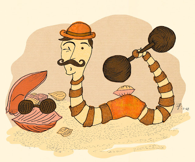
"This week's" Illustration Friday topic is (if I remember correctly) STRONG. This sketch is from 2013 so this concept is pretty old. I don't exactly remember all the details or the train of thought behind my artistic choices here. I can outline a few things that I know interest me and would have played a hand in coming up with the idea of an earthworm lifting as my illustration concept for "strong."
First of all, I can't help but crack myself up. I think the idea of an earthworm flexing his "bicep" for the object of his affection is pretty comical. The clitellum (that middle part that looks like a sleeve) reminds me of fitness wear or fitness gear like spanks or a headband. So if an Earthworm were to be into weight lifting, I would have imagined this would be something they would wear to workout in (even though it is part of their physical anatomy.) It also is the perfect place for the worm's "bicep" if they were able to flex one. I guess maybe this came to mind because if we were comparing this to a human, he is like a head attached to one single arm, lifting weights... which is weird but also makes me laugh.
...what can I say? I'm strange.
This particular theme is a bit fitting to me at this moment. Over the past year or so I have gained and lost weight due to illness and I can feel a connection to this image as I reflect on my own personal fitness journey to find a healthy balance within my own body at this particular age in life. This image, in a very whimsical and fun way, reminds me that you always have something to "flex" regardless of where you are in your health journey, your size, or your age. And that is a nice thought to walk away with.
This illustration is also inspired by Victorian Era Strong Men from the circus, Shoreside Bathers, and Seaside postcards. I have always had an affinity for the style and aesthetic of this particular time period and it often finds its way into the illustrations I create. Might I point out the stripes that makeup Mr. Worm's anatomy, echo the striped patterns of a man's bathing suit from that time period?
For those of you who do not know what a seaside postcard is or its significance in regard to art and censorship:
A seaside postcard is a regular postcard meant for regular postcard type uses that were created and sold at seaside townships in the UK. They were a way of letting others know where you had chosen to "beach" at. Many of the illustrations, while beach and township themed, would also include figures of people in their bathing suits posing in various ways enjoying their time by the ocean. Sometimes there would be a comical scene illustrated that would suggest something vulgar. Many of these images began to be seen as racy, vulgar, and provocative. It became such a controversy in the UK that house raids were conducted to search for and destroy these cards due to the 1857 Obscene Publications Act. Even today, modern society still struggles with erotic art and its censorship. **cough cough Meta/Facebook/Instagram cough cough**
My favorite reference to this iconic piece of erotic art history is from Downton Abby:
Mrs. Patvmore to Mrs. Hughes," Mr. Carson wouldn’t be vulgar if they put him on a seaside postcard." I definitely want to see that postcard lol.
While a man flexing his muscles may seem like a prerequisite and common staple for social media accounts today, during this vintage Victorian Era, it would be the type of things women might faint over (in more ways than one.) Very racy. Very provocative. And I wanted to pull that topic into this illustration, even in the most subtle of conceptual ways. I'm not above obscure subtlety. lol
I chose a Sepia-themed color scheme to reflect the time period I wanted to encapsulate on my own personal Seaside Postcard. While I decided NOT to be so on the nose and place a "rivetted postcard border" around the edge of the frame, I still may actually use this illustration on a postcard, either for self-promotion or just to sell in my shop. Racy Wormy Seaside Postcards for everyone!!! lol
Until next time, friends...
Keep dreaming, keep sketching, keep thinking, keep laughing, and most important of all, keep making art.
P.S. See?! I can write a more brief blog post again! lol


Comments
Post a Comment