Design: Organically Grown

There's nothing in this world like a nice
Hot, Home-Cooked Meal. There really
isn't. The food always tastes better
than anything else you usually will ever eat, or remember eating, and your home
smells amazing for hours and hours long after it's been cooked. Our warmest
memories in life usually revolve around a hot meal with friends and family at
the table (or in front of the television. lol.)
That's usually what everyone remembers most and looks forward to: A Slowly-Cooked-on-the-Stove-Good-Old-Fashioned-Hot-Home-Meal. It could cure the world of whatever is ailing
it, in my opinion.

I am thinking about this because I just
cooked a meal this evening. Granted the vegetarian stuffing-stuffed "Turkey Champagne

The past year and a half, I had been
thinking a lot about what I was eating and I got an opportunity to create
something that would inspire others do the same... or at least consider
it. I was hired to create a logo for a
new Grocery Shop, the Center Stage Market.
The Market was opening in my local community. It specializes, not only in
Organic Foods, but more specifically Food that is grown and cultivated right
here in Georgia
To give me some sort of starting point, Kat
(the shop owner), gave me quite a bit of reference materials to work with as I
really had no knowledge of the farming world, food industry or the food market
in general, let alone knowledge about food that is growing, quite literally, in
our back yards. And as some of you out
there know, I TOTALLY am down for some good ole fashioned research when I'm
working on an Art project. If I'm not
informed on the subject, I want to get informed about it. So I "dig."
lol ;0)

Kat gave me books that entailed information
about organic farming and Georgia


Now contrary to most cliches, not
everything an artist does, or comes up with, appears in their heads like a
swift jolt of creative lightening. This sometimes is the case but 97% of the
time, we artists have to work for all that "good stuff." Like anything that is worth anything in this
life, it takes time and hard work to achieve it.

I'd say that the best art one does in life
usually takes a whole lot of love and a lot of work. The percentage of each
varies from project to project. The progress
is slow and sometimes the evolution of the work can also be slow. This isn't
necessarily a bad thing. "Slow and
steady wins the race," as the fable tells us and this particular project that
I completed last year is no exception.
A little over a year and a half ago, I was approached by
Kat to create a logo for her newest venture, a grocery store that would embrace
and encompass what was already being done with the Picky Eaters Co-Operative,
but taking this to the next level: Making these foods accessible to the entire
community, not just to the members of Picky Eaters. She would sell not only hard to find organic
food products but feature produce, meat and dairy products from Georgia

This concept really excited me and I accepted Kat's job
and challenge to create a design that would represent this new venture. As always, I began with a lot of
research. I confess I knew little about
Food Co-operatives at the time, and even less about the agricultural industry
of my home state, Georgia

As an aside: I've always been a very studious
individual. I love learning and learning about new things. Unfortunately we can't spend our lives making
a living as professional students. School eventually ends and we all must move
on. This obviously doesn't mean we have
to stop learning. I get really excited
when a project comes along and I get to learn something brand new to prepare my
mind to create something related to that research. I guess this trait is what
always will define me as a nerd or geek, because I get REALLY Excited about
learning and about new things I previously never knew about.
As I stated previously, good design does take time and
you could compare it to the agricultural analogy of growing organic foods. So you might say that I was planting the
seeds of this design project by burying myself deep into new and intriguing
information; allowing my mind to be enriched and soak in all that I was
learning and setting in my creative roots to grow something. Didn't know what I
would be growing as of yet, but it would definitely be something.

Before we move forward and talk about some of the
concepts and ideas that grew from my research, allow me to sprinkle a few did
bits about Food Co-Operatives and The Slow Food Movement:
Picky Eaters was a food Co-Operative and a Food
Co-Operative is a food distribution outlet
organized as an autonomous association of people united voluntarily to meet
their common economic, social, and cultural needs and aspirations through a
jointly owned and democratically controlled business. Food cooperatives are usually just members of
a community that get together and make decisions regarding the production and
distribution of the group's food are chosen by its members. Food cooperatives
typically offer natural/organic foods.
Since decisions about how to run a cooperative are not made by outside
shareholders, cooperatives often exhibit a higher degree of social
responsibility than their corporate grocery chain store comparatives.
Food Co-operatives follow the 7 Cooperative Principles.
These are:
1. Open membership.
2. Democratic control (one person, one vote).
3. Distribution of surplus in proportion to trade.
4. Payment of limited interest on capital.
5. Political and religious neutrality.
6. Cash trading (no credit extended).
7. Promotion of education.
You may be wondering why people would go to great
lengths to grow, distribute and purchase food in this manner. Well, many people believe that the processing
and globalization of food. Mass
production and distribution decreases its nutritional value, shelf life and in
many cases becomes unhealthy to consume.
This isn't just the use of pesticides, growth hormones injected into
animals or salt content of processed/packaged foods, this is also because of
genetically engineered and grown produce that attribute to and cause many of
the major health issues people now face: heart disease, acquired food and drug
allergies and even cancer. So you can
see why people would prefer organic foods that are produced on a smaller scale
and distributed by groups like the Picky Eaters here in Americus
In a previous blog post, I discussed a little about the
Slow Food movement so I won't go too much into what it is, but it's a grass
roots movement that was founded in Italy
You can learn more about Food Co-operatives and the Slow
Food Movement by clicking on the below linked Images.


Lets talk about the Ideas; the seeds of what eventually
grew into the final design for the Center Stage Market's Logo. I worked on this for several days, coming up
with many different ideas that would possibly represent what this store would
be. In the beginning there was going to
be elements to the store that untimely ended up either evolving into something
similar or just being weeded out entirely by the time the store actually
opened. Kat and I worked on this design
project together over the course of a little over a year before it was completed. It was a true collaboration of ideas that
shaped the final design. However, in the
beginning, the store was still in development and I was designing for what it
would possibly be at that time. So in
that sense it was challenging because certain things that were originally
planned for the store would be changed.
The design of the logo quite literally grew organically with the
development of the store it was to represent simultaneously, which was an
interesting experience and one that does not "sprout up" too often.
;0)
Some of the things, that were originally planned for the
store and may come to fruition for it in the future, were creating a stage from
the expansive windows that make up the front of the store. There were, originally, going to be local
musicians that would play live at the store while people shopped. Even though, this did not come to be, you may
see a variety of things going on in the windows of the store front. Occasionally I see artists working on their
art in those windows. It’s a variation
of the original idea and I loved it.
This was one of the primary reasons the Market would be called Center
Stage, referencing the actual stage that would be in the store. This concept was also to be combined with a
sandwich or cafe style seating area where customers could come in for lunch and
enjoy the afternoon music. For many
logistical reasons, this idea was taken off the table, but the name of the
Market remained because it was also a reference to bringing the Farmers and
Good Organically Grown Local Foods back to the Center Stage, which is the
slogan and one of the founding principles of the market. My point in mentioning these details of this
project is that many of the ideas that were originally created for it were
changed for these reasons. As the store
model would change, so would its iconic representation. With that said, let's take a look at the
menu…
There were 12
Ideas created for this Logo.
Logo Concepts for
the Center Stage Market in the order they were created:

Idea 1:
Kat sent me many images on Pinterest to help me understand the nature of and
visual direction that the market was taking.
Also, once the store location had been renovated, I would meet with her
for her to show me certain things to provide inspiration and additional
direction for the logo design. On one
such meeting, Kat showed me these beautiful wood slat crates that she uses to
place the market's produce in. I really
liked them and it did inspire me to add certain elements into the logo, some of
which made it into the final design.
This particular image was inspired by those wood slat crates. I really like the idea of creating a
scratch board image (a medium I had been experimenting with at the time she
hired me) and I thought it would bring an intriguing aesthetic to the design. I
played with visually combining the domestic activities of cooking and eating
with the process of growing and cultivating food. In this image the plate and the cutlery would
be organically growing as if they were still planted in the ground. It was to
have a wood cut print look to it and would have been illustrated in
scratch board. The typography would be
organic and handmade in nature.

Idea 2: The main objectives I needed to remember
about this project were:
-Food is the Primary Focus,
-This market is about making LOCAL, FRESH and HEALTHY
foods accessible.
- It is about bringing our local COMMUNITY together and
connecting it to the LOCAL Agriculture.
In this second image, I was going to make the market's
founder, Kat, into part of the branding itself. I was going to illustrate her
likeness into the main central figure. That
figure is holding a bag or basket or box of fresh organic foods. She is flanked by toothier figures that would
visually represent the community. The
circular frame around them would represent a plate and would have a variety of
fresh foods that would border around the plate.

Idea 3: In this concept, I wanted to use the plate
element and transform it into a series of repeating circular images. In each
"plate" there would be a silhouette "Cut-out" that
represented the domestic, the agriculture or this community in some way. It was going to have a very clean or modern
aesthetic to it.
Idea 4: This
concept focused more on integrating the "spotlight" element into the
logo. The plate would have an
arrangement of illustrated food in the shape of the "healthy heart."
The plate itself would be come the center of a "Sun" image which
represents on of the 2 main sources of life and an important source of energy
that grows our food. The rays of the Sun
would have been made up of either vegetables or hand prints representing the
community we live in and the "fuel" that keeps us going. The illustrated icon would look like a stamp
or screen printed design that would be placed on a Brown grocery bag design
element. The brown rectangular bag would provide a vertical framing for the
logo.

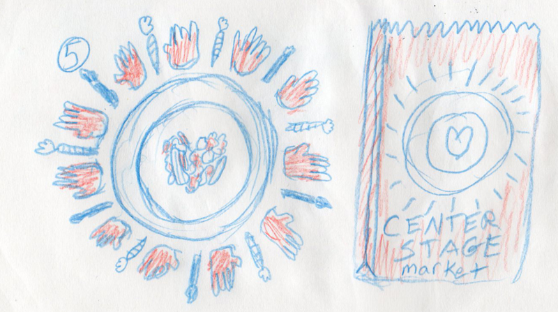
Idea 5A: This concept explored more of the stage element for the
design.
You would have a plate setting with the image etched on
the plate of a farm scene with abstract people representing the community the
farm house in the center of this scene would have a heart cutout made up of two
leaves.
It would then be framed by the wood slats and a series
of farm crop rows would make a curtain shape outside of the place setting,
creating the “stage” for the market.
Idea 5B:
This is the same visual concept except we take the curtain element and place it
inside the plate setting and remove the slate frame from around it.

Idea 6A: This concept
combined the aesthetics of old fashioned general store signs that you might
associate with the late 29th century and early twentieth century
sign design with the complex and ornate design of theater marquees. The Plate would be the central architectural
feature of the “marquee” and other surrounding elements would echo
architectural elements that make up the structure of a physical theatrical stage.
These elements would be comprised of a variety of fresh foods.

Idea 6B: This idea is the
same basic concept as 6A but the “marquee” is comprised mainly of the wood slat
crate full of fresh veggies and the plate still being the central element of
the marquee would feature the farmhouse image with the Leaf-Heart cutout.


Idea 7A & 7B: These two
concepts are a further extension of the concept for Idea 6A&6B, but are
alternative designs of different style theatrical marquees and how it they
could be assembled. So essentially 6A,
6B, 7A & 7B all fall under the same creative concept, but are just
different ways it could be executed.

Idea 8: You may already recognize this particular
thumbnail concept as it is the origin for what the final design for the market
came from. Believe it or not, this was
my “throw-away” idea and by this I mean it was just some fun thought that
popped into my head and I threw it in the mix but never really took it
seriously because I didn’t think that Kat or anyone else would take it
seriously. It’s kind of funny how things
work out that way. I never intended that
anyone would ever go for this idea. It was just something cheeky and fun that
popped in my imagination as I was brain storming for other alternative ideas
for this design. The concept is
basically an homage or Meme, if you will, to Shakespeare’s Hamlet pose.
However, the actor is a farmer and the “skull” he is holding a peach, to
represent the Peach State of Agriculture.
I thought the peach could be replaced with any food or a bag of market
fresh groceries. Behind him is a “scene”
on the farm where he contemplates, “To Farm or Not to Farm? That is the
Question.” He is then Frame by a diamond
shape made of the Wood Slats which were an over simplified “curtain” shape.

To be honest
I was thinking in my own head, “To Draw or Not To Draw?” but I was just being
silly with myself to break my focus thought on creating ideas, which I find a
very efficacious way to brainstorm.
Thin, think, think, think, play, think, think, think play, play, think
some more. It’s ridiculous but it
works. I really almost didn’t pitch it
in my original presentation of these concepts to Kat, but I told her that I
came up with it just for fun, thinking she might find it amusing and we would
move on to select something else. But
she really did like the idea of this little guy and it spoke to her. Art really does become different things to
other people once artists put it out there in the universe.

Idea 9: This concept really relied on something that
was trending in screen printing here in Georgia Georgia with the image of the state of Georgia

Idea 10: I took what I liked from Concept 8 and
created something with the Georgia Peach as this is the agricultural food that
is most associated with Georgia North Carolina Georgia should really be called the Blueberry State Americus

Idea 11: In this concept, I wanted to use the wood
slate produce storage bins that Kat would be using for her store, but this time
it would be seen from the top or “bird’s eye” view. You would be looking down as a viewer into a
bin full of fresh foods. In the center
of the mix the food would create an image of two hands holding a heart that
would have probably been made of peaches.
This was, of course, before I learned that Georgia
was the Blueberry
State

Idea 12: Last but certainly not least was my second
favorite idea, which was the last concept I came up with for this project. I took the dinner place setting and the farm
and integrated the two together in a more conclusive way than I had in previous
ideas. I decided that this logo would be
a circular one and the plate would have a ribbon that would be made up of a
napkin or of a burlap sack. The cutlery
of the place setting would be what is being planted in the ground (represented
by the visual banner that crosses over the center of the plate.) The spoon/tree/crop would have “rays” that
radiate outward implying the Sun and the Spotlight and the Forks would become
trees. You see a barn and a farm house
amongst the crop rows above. Below would
be an intricate yet simplified network of the root system of the 3 pieces of
cutlery. You would see a variety of
foods intermingled in between the roots.
Personally as an artist, I am most attracted by texture in art and
architecture and this logo concept would embody that. It would be completely
about texture in the simplest way I could.
This image would also have the mono-print print style aesthetic to it.
...Now Breath….
It’s always
good to take a break from a long article. It’s healthy. ;0)
A lot happened and was produced over the course of this
project and I wanted to talk about it from conception to seeing the store
itself with its final signage. So stretch your legs, stand up, spin around…
Or whatever
it is that you do when you take a break from reading
We still have a ways to go. Lol
After my
initial presentation of these ideas to Kat, we took the time to really “weed
out” the ideas that just really wouldn’t work. She expressed her interest in 3
of the ideas that really spoke to her. She
wanted me to work them up a bit more and refine those 3 so she could make a
final decision on which direction we would be GROWING.
Kat really
liked Ideas 12, 5A and, of course, 8 (the chosen one.)
So the next step was to care for the little seedlings
and by this, I mean developing the details of the thumbnails and defining them
more into fully fleshed out ideas. The
little saplings were growing along well and I was pleased with the outcome of
all three ideas. I felt like any of the
3 would be strong candidates to represent the Market well.

Kat
gravitated to the Farmer holding the Blueberry. She had previously given me
some notes on what to add to it specifically. One was to make the peach a
blueberry. She also wanted me to add a cow and chicken and take out most of the
farm scene. We had discussed also about
making a sunrise behind the characters. This would both simplify the image and
also give the farmer and his gesture more emphasis. Kat made the decision at this meeting to go
with the Shakespeare-inspired farmer.

However, like
many newly sprouted crops, this one was not quite ready for the plate just
yet. It had a lot of growing left to
do. The design evolved into different
things at this stage in the project. We
replaced the crop rows with grass. We
brought back the slat wood diamond shaped frame. We replaced the blueberry with
another of Georgia

The Farmer
also went through a variety of transformations.
Kat wanted him to have the likeness or appeal of a Paul Bunyan sort in
the beginning. We made him more of a Man-like Character by increasing
his stature and adding muscles and changing the proportions of his body
structure. We also made a female version
of the farmer. However, in the end we
just came back to the first farmer as there was just something about him that
had an appeal that the other variations of the farmer character did not. I’m not really quite certain what gives him
more appeal than any of the others, because the other characters would have
also worked out well, I think. He just…
WORKS. And so we were ready to move
forward with the final graphic work for the illustrated element of the logo.

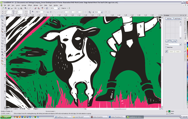
I etched the
illustrated image out of scratch board. I
really wanted the image to have that woodcut print feel to it. I admit I have never made a woodcut before. I had experience in linoleum cut prints. I thought I could create the “feel” of
woodcut through the scratch board medium.
After I was done with the illustration, B was kind enough to photograph
it for me.

**Just a note about scratch board work (for any of you
wanting to dabble or experiment in it): You can’t scan it into your computer,
you have to light it and photograph it if you want the image to be digitally
accessible. For whatever reason a
flatbed scanner cannot capture the image if you create it on scratch board. Sad but true.
Once I had my illustration in a digital format
I was able to manipulate it and vectorize it.
One thing I remember about this project is that even though the
illustration looked great on the scratch board, I found that it was TOO DETAILED
to be applied for use in a branding system.
So I spent A LOT of time deleting and “cleaning” up the illustration
afterward to make it simplified enough for logo use but also still keep enough
detail to echo that woodcut print aesthetic I was going for.


At this point
our design is only HALFWAY GROWN in its field.
The Icon may be complete, but now we begin the other half of our farming
design adventure: typography and layout.


I usually
handle these 2 parts of a branding system simultaneously. For most logo designs, the layout and design
composition are already in place after I create thumbnails. There may be some minor tweaking, but
ultimately, it’s already in place. I
find that when I was working on this project, it was hard work every step all
of the way.
 I’m not quite certain why it
was so, but it’s just funny that it took a long organic process to get through
to the final design on this project and that the project was to represent a
market that specializes in food that is grown much the same way; no short cuts,
just plain everyday hard work to reap the final rewards.
I’m not quite certain why it
was so, but it’s just funny that it took a long organic process to get through
to the final design on this project and that the project was to represent a
market that specializes in food that is grown much the same way; no short cuts,
just plain everyday hard work to reap the final rewards.
When I look back on this project, I find that part both
poetic and fitting. I think to myself, “of course! This is exactly how this
should be done.”
I’m never afraid to just “Dig in” to something and work
a little harder to make sure that it’s done right and that not only is the
client satisfied with the end result, but also that I am as well.


So I created
and played with the layouts and discussed them with Kat in a few different
meetings. I used mock typography in them
just to show placement and arrangement of text.
These meetings were usually over some great coffee and snacks at our
local coffee shop, Cafe Capesino, which I remember Kat remarking that you may
find her there quite often. Anyway, we
would have split meetings there at the coffee shop spending half of our time
looking at layouts options I had come up with and the other half of the time
looking at type options and arrangements that I would also come up with. The logo grew over the course of these
particular meetings and evolved into the final design that you can now see on
the store front itself.


Our last few
meeting were on the subject of color. I
usually always tend to research concept appropriate color schemes and
options. If I recall correctly we ended
up combining a few of the colors from a couple of the different schemes into
the final color palate used in the final logo.
Even though color choice in a branding system is very important, it felt
more like a foot note in this project; more of a trimming-up of the final grown
crop to get it ready for harvest. I felt
the journey and heavy work of this design project lay more from the conception
and development of the illustrated image and also a bit in the typography
portion. It makes sense. For you green thumbs out there; the hardest
part is to grow from the seed and nurse the seed into its full potential. I feel that the process of creating this
brand was very similar.
The logo was
ready roughly around 6 months before Kat was ready to open. I was very eager to share it but naturally
(and legally) needed to wait until she opened before I could share this project
with everyone.
The Center
Stage Market is alive and open for business here in Downtown Americus. They
specialize in Fresh Regional Produce, Meat and Seafood. They also have a variety of great Specialty
groceries that you’re not going to find just anywhere. So I encourage everyone
who is local or close enough to be local to stop in Kat’s amazing Market and
say hello and pickup some great food.
Everyone there is very friendly and very helpful and I have found in my
personal shopping experiences there that if you don’t see what you’re looking
for that it can and will be ordered for you. Who could ask for anything better?


So in
conclusion, I reiterate what I previously proposed. Design can be like that amazing meal that you
cook from scratch; that meal that makes your home smell more amazing than it
ever has before. Food has the most
amazing power to change your mind about almost anything. It could even possibly change the world with
the right ingredients. I would say that
Art and Design have the same potential to do the same. So this is where I leave you all. I must get
back to making dinner… I’m kinda hungry now. Lol

Until next time, friends,
Keep sketching, keep thinking, keep laughing and most important of all,
keep making art.
Cheers,
LEWIS
Keep sketching, keep thinking, keep laughing and most important of all,
keep making art.
Cheers,
LEWIS

Comments
Post a Comment