ROCKING THE ART: VOL.3: BEING SELFISH

Welcome back, friends, and welcome back to Rocking the Art: Vol.3. We are going to dive deep into the art of album concepts, musical personas, and that line between fantasy and reality that musicians sometimes like to artistically explore. We will get to have a one-on-one discussion with Billy Collins, Selfish himself, and learn more about where this character came from and where he might be going. Speaking of personalities, we also are going to take a look at some of music history's well-known album artists and designers.

As we know, ever since the 20th century, there has been a symbiotic connection between art and the music it represents. Most of the time we associate the music directly with either the album cover of the album the song is from or the music video for it. We already know many of the iconic images, but let's learn a little about some of the artists behind the art. I can't discuss all of them (there are so many) so here are 13 of the most influential album art artists:

The moody photography of Francis Wolff and the artistic genius of Reid Miles became hugely influential in the world of music and graphic design and turned Blue Note album covers into enduring cultural gems.
Chicago-born Miles, who had been an Esquire magazine journalist before working in music, created a “hip” brand identity for Blue Note, which was the epitome of modern, cool, and progressive. Miles was not a jazz fan and was thus able to stand back and analyze what would make a great cover, irrespective of the musician involved.
He had small budgets and worked speedily. As he once said: “Fifty bucks an album… they loved it, thought it was modern, they thought it went with the music… one or two colors to work with at that time, and some outrageous graphics!”
In the 60s, Miles began to concentrate on photography and he became a hugely successful figure in advertising. However, his modern jazz designs – some with stunning and wild typographical expression, such as Lee Morgan’s The Rumproller – created a superb legacy, marking Reid Miles out as one of the earliest album cover designers to take note of.

Barney Bubbles (1942-1983)
Londoner Barney Bubbles, who changed his name legally from Colin Fulcher, trained at Twickenham Art College and worked at Terence Conran’s groundbreaking consultancy, before moving into record design.
During the 70s and early 80s he created record sleeves, label logos, and music-related visuals for innovative musicians such as Elvis Costello, Nick Lowe, Billy Bragg, and Ian Dury, for bands such as Hawkwind, and for companies including Stiff Records and the weekly NME. He also worked on music visuals, including the striking Specials video for “Ghost Town.”
His early work included the cover for the triple-album Glastonbury Fayre, which opens out from a gatefold to a huge six-panel poster. Bubbles would incorporate different art styles and photography – as on the beautiful cover for Costello’s Armed Forces – and created album sleeves of cryptic intricacy. Bubbles, who often worked using obscure pseudonyms (there may be some unknown Bubbles albums still out there), took his own life, at the age of 41, on what would have been his late parents’ wedding anniversary.

Hipgnosis (1968-1983)
Hipgnosis – a term mixing “hip” with “gnosis” (meaning “mystic thought”) – was coined by Pink Floyd’s Syd Barrett for the design pairing of English art student friends Storm Thorgerson and Aubrey Powell, when the band asked them to design the cover for their 1968 album, A Saucerful Of Secrets. In the following decade, the company became pre-eminent among the most forward-thinking album covers designers in the world.
Hipgnosis went on to produce nearly 200 covers, some of which were the most radical album sleeves in music history, including Black Sabbath’s escalator robots (for Technical Ecstasy) and Peter Gabriel’s melted grilled-cheese face (for his self-titled 1980 solo album). Powell said: “We always tried to think laterally and not go for the obvious. When we saw Sgt Pepper’s, we went, ‘Oh, my gosh, we can do this, but let’s think differently.’”
Their album cover for The Dark Side Of The Moon, featuring white light splitting as it hits a black prism, is one of the most famous images in music. As the desire for lavish album covers waned in the early 80s, Hipgnosis switched to advertising and film work.

Storm Thorgerson (1944-2013)
When Hipgnosis came to an end in 1983, Storm Thorgerson started a company making concert films and music videos, including works for Robert Plant, Kajagoogoo and Big Country. The former Cambridge graduate, responsible for so many great Pink Floyd covers as part of Hipgnosis, continued to work on album covers in the 90s, many of which displayed his outlandish photographic images. Thorgerson insisted on doing almost all his photographic shoots on older equipment, largely ignoring the advent of digital technology.
Among his later triumphs were album covers for Catherine Wheel, Phish and The Cranberries. His creativity was not halted by the arrival of the CD, and his design for Pulse, the Pink Floyd live CD, featured a flashing light on its spine.
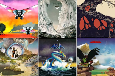
Roger Dean (born 1944)
Roger Dean, the celebrated artist, designer, architect, and publisher, created some of the most famous prog rock covers of the 70s, especially for the band Yes, starting with the album Fragile. Dean also designed the classic Yes “bubble” logo, which first appeared on the album Close To The Edge.
His images were ambitious and unusual. His cover for Tales From Topographic Oceans (1973) was a landscape painting based on English coasts taken from Dominy Hamilton’s postcard collection, mixed with representations of the Mayan temple at Chichen and the plains of Nazca. As with so much of Dean’s great art, the result was incongruous but powerful.
Dean also supplied the original Virgin Records logo in 1973 and based his cover of Steve Howe’s first solo album (Beginnings, 1975) on the landscape seating he designed for Ronnie Scott’s jazz club.

Vaughan Oliver studied graphic design at Newcastle Polytechnic before creating designer drink labels. He moved into the music design business in the 80s, earning a strong reputation for his album covers for British independent record label 4AD. Oliver said of his work with Pixies: “Working with the Pixies over the last 30 years has always been full of natural inspiration for me as art director and designer. Their lyrics are packed with strange and wonderful imagery.”
His imaginative typographical work has also been featured on albums for Cocteau Twins, Scott Walker, His Name Is Alive, Heidi Berry, and Throwing Muses. He has also done the artwork for an album by acclaimed film and TV director David Lynch. Despite all his triumphs, Oliver insists that he stands apart from album cover designers: “I don’t see myself as an artist; I’m a graphic designer.”

Peter Saville (born 1955)
Manchester-born Peter Saville was a co-founder of Factory Records, and though his early work included album covers for several bands, the most celebrated are those for New Order and Joy Division. “I had the opportunity to make the kind of objects I wanted to see in my life,” Saville said about the creative freedom he enjoyed.
For his iconic sleeve for Joy Division’s 1979 record Unknown Pleasures, he based the design on the first pulsar, from 1919. For other sleeves, he used hieroglyphic visuals, juxtaposed antique images with postmodern ones (as on Joy Division’s Closer), and almost always brought to bear his expertise on modern typography.
Saville lost interest in album design and went on to numerous triumphs in other fields, including designing the 2010 England football strip, making adverts for Dior and becoming creative director of the city of Manchester.

Stanley “Mouse” Miller (born 1940)
California-born artist Stanley “Mouse” Miller cut his teeth as a hot-rod painting sensation modifying dragster cars. He then moved into designing the psychedelic posters which were a feature of the San Francisco landscape in the 60s. He is best known for being the creator of the famous “skull and roses” logo adopted by Grateful Dead.
"I found the original image in the stacks of the San Francisco Public Library,” said the painter. “It was created by an artist named Edmund Sullivan to illustrate a poem in the Rubaiyat Of Omar Khayyam. I thought, ‘Here’s something that might work for the Grateful Dead.’”
His work with the Dead continued through many classic albums, including Workingman’s Dead and American Beauty. He also designed iconic album covers for Steve Miller and Journey.

David Stone Martin (1913-1992)
Chicago-born David Stone Martin studied at the city’s Art Institute before making his name as an album cover designer and artist, something that grew out of a friendship with pianist Mary Lou Williams. His album portraits, mostly drawn in distinctive, heavy black-ink lines, include Count Basie, Charlie Parker, Billie Holiday, Art Tatum, John Coltrane, Ella Fitzgerald, Dizzy Gillespie, Stan Getz, and Duke Ellington. He did most of the covers for the Asch, Clef, and Jazz At The Philharmonic releases of the post-war era.
Martin went on to create covers for Life and Time magazines, including memorable ones featuring Eugene McCarthy and Chairman Mao. Cementing his reputation as one of the great album cover designers, his work is included in the collections of the Museum Of Modern Art and the Smithsonian Institution.

John Berg (1932-2015)
Brooklyn-born John Berg worked as a cartoonist and was hired by Columbia Records in 1961 after a spell working for Esquire magazine. Berg, who had never worked on a record album before, made more than 5,000 artworks over the next quarter of a century, including iconic covers for musicians as diverse as The Byrds, Simon And Garfunkel, Bessie Smith, Bob Dylan, and Chicago.
As art director he won four Grammy awards and commissioned covers from some of the foremost artists of the period – including Edward Sorel and Tomi Ungerer – and from top-class photographers such as Richard Avedon.
His judgment was severe and often incisive. When he was creating a cover for Born To Run he rejected the somber photograph that Bruce Springsteen had chosen, saying it made the singer look like a “John Updike-type author.” Berg went through the contact sheets and found an intimate image by Eric Meola of Springsteen laughing as he leaned on Clarence Clemons’s shoulder. It was a typically shrewd move by Berg – and one of the greatest of all album covers was born.

Peter Blake (born 1932)
Peter Blake, who has an indelible place as one of the most famous album cover designers in history, actually went into the world of art by chance. He attended a technical school and was heading for a career as an electrician when he decided to take an exam in drawing. He passed with flying colors and was offered a place at an art school in Kent.
Blake will forever be associated with his work on one of the most important covers of all time: Sgt Pepper’s Lonely Hearts Club Band. For just £200, Blake turned Paul McCartney’s rough sketch of a bandstand into a three-dimensional set in his studio. The set, which included flowerbeds and statues and a cardboard cut-out of what Blake called “an audience that could include anyone they wanted”, was the setting for The Beatles in their remarkable outfits.
Blake later created the cover for the Band Aid single “Do They Know It’s Christmas?” and worked with superstar modern bands such as Oasis. When he designed The Who’s Face Dances in 1981, he commissioned leading British painters, including David Hockney and Patrick Caulfield, to paint portraits of the band members. A rarity among album cover designers, Blake has continued working into his 80s, including on artwork for St Paul’s Cathedral.

Cal Schenkel (born 1947)
Cal Schenkel was a college dropout with just a semester of art courses behind him when he met Frank Zappa. He soon became Zappa’s “art engineer”, responsible for a host of fantastic album covers, among them the Sgt Pepper parody We’re Only In It For the Money. He went on to design dozens of albums for Zappa, including Cruising with Ruben & The Jets, and his work was a forerunner of some new wave and punk designs.
Schenkel has collaborated with key figures in the musical avant-garde of the modern age, including Tom Waits. When he was working with Captain Beefheart, Schenkel bought a carp from the market, hollowed out the head, and affixed it to Beefheart’s face for the cover of Trout Mask Replica. In recent years he has worked for publishing firms.

HR Giger (1940-2014)
Unique among album cover designers, HR Giger won an Oscar for his “xenomorph” creature in Alien, and continued in the film business for more than four decades, including working for Ridley Scott’s 2012 hit, Prometheus. Giger, who had studied architecture in Zürich, also designed video games and worked in interior design.
The surrealist Swiss painter was in demand in the music business. Among his many triumphs was the 1973 cover for Emerson, Lake & Palmer’s album Brain Salad Surgery, which keyboardist Keith Emerson said the band chose “because it pushed album cover art to its extreme.” He also changed Debbie Harry’s popular blonde girl image with his cover for KooKoo, and the singer liked it so much she subsequently hired Giger to design two of her music videos. He died in 2014 from injuries sustained in a fall.

Let's talk about persona as an album concept. For decades, music artists have been experimenting with their sound and even themselves. Creating a body of music around a character or personality has intrigued and inspired so many musical artists we know and love. A few notable and recognizable examples are that of David Bowie as Ziggy Stardust in his album The Rise and Fall of Ziggy Stardust and the Spiders from Mars. Another recognizable example is Tori Amos as incarnations of the Five Greek Muses from her album American Doll Posse. Both of these artists didn't only write and record music as these personas, but they became them for a brief period of time. They would tour and perform live as these characters as well. The entire experience is quite immersive.

This Blog post is dedicated to Billy Collins' album Selfish, Accoustic Songs for the Night Life. For this special post, I asked Billy if he would be so kind as to answer a few questions about Selfish so we could all learn more about the persona created for this record.

Lewis W. Porter: Who is Selfish? and where did he come from?
Billy Collins: Selfish spawned from an Ayn Rand addiction. The first “album” EP was based on Francisco d'Anconia, a character from Atlas Shrugged, who built this facade of a playboy while secretly conspiring to change the world.
LWP: Why was it important to you to dedicate an album to this persona?
BC: I was a 20-year-old kid that wanted to change the world. I was good with women & thought of myself as a Francisco. The intent was to go mainstream & later use my platform to advocate atheism, the beauty of mankind, heaven on earth, etc.
LWP: How close is Selfish to Billy Collins? How is the Selfish persona different from who you are?
BC: I became Selfish, literally. The original intent was failing & I fell into a party lifestyle. It really became a cycle of chasing women, using those encounters to write new songs, & then using those songs to attract more women. I knew I was trying to feel a void within myself, but I didn’t care. I was having fun in a tormented way.

LWP: Would you be friends with Selfish if they were a separate real person? Would the two of you hang out?
BC: Abso-fucking-lutely NOT. Nearly 15 years later my entire philosophy on life has shifted. I love the stories of my past. I don’t wish to shut the door on them. But after some military experience & becoming a father, I value maturity more. I also went from “man is an island” to “the virtue of the collective”. So Selfish is a piece of me that faded with adulthood & compassion.
LWP: What does Selfish value most in the world? What does Billy value most in the world?
BC: Selfish was an Ayn Rand enthusiast drunk on womanizing & debauchery. In hindsight, it was all pure narcissism & delusions of grandiose. Today I’m a liberal on the opposite end of the spectrum, so it’s hard not to think of all of this as misguided youth. I loved it all while it was happening though. I truly had a good time. The music, the sex, the partying. It was wild.
LWP: If Selfish were to record a record in 2023, what would they sing about? What would that record be like? How would it compare to this first one?
BC: So, new music in 2023... At 36, I am planning a new era for my music. I’m recomposing old songs, mixing them with new songs, and looking to form a studio band instead of employing hired hands. Selfish grew up and changed his ways. I’m keeping some of the more romantic songs & hoping to present a more mature image. I’m very excited to work again.

Billy, first, I want to thank you for agreeing to do this little interview for the blog. Secondly, I want to thank you for being so candid and allowing us all to look behind the veil and "meet the wizard" behind the music. Thanks for being here, Billy. We all look forward to hearing the new music you're working on.
When Billy and I first met, it was at a quaint coffee shop in downtown Macon (Georgia). It was a popular spot, right across from the public library (one of my favorite locations in the town.) We had discussed the persona of Selfish, what they meant in regards to the record, and in general why it was important to record this record under the pseudonym. We then discussed aesthetics while we looked at some of the art samples I had brought with me to that meeting. I had brought a wide variety as you never know what another artist might be searching for in regards to something visual. I mentioned the then-trending album aesthetics of other indie rock artists at the time, citing examples from artists such as Death Cab For Cutie and Say Hi. However, Billy was really interested in these ink and watercolor sketches I had made of some locations in Savannah (Georgia) when I lived there. He said he really liked the look and feel of those sketches. They were loose and organic and, even though I am biased of my own work, I could definitely see their appeal.

The record wasn't recorded at that time, so all I had to work with was a printout of the song lyrics. So I read and studied them and began to work on how to build a bridge between what Billy had written to the organic aesthetic he wanted to represent it with. I really dove deep into those song lyrics and pulled out a few different concepts to visually represent them.
You will have to forgive me a little. I am reconstructing thoughts and ideas from this project based on old sketches, a few notes (not many), and memory; all of which there's not much left of. lol. In my defense, it has been 13 years since Billy and I worked on this project.

The first concept I drafted for the record if I remember correctly, was a Titan. The Titans, also known as the elder gods, ruled the earth before the Olympians overthrew them. The ruler of the Titans was Cronus who was de-throned by his son Zeus. Most of the Titans fought with Cronus against Zeus and were punished by being banished to Tartarus. During their rule, the Titans were associated with various planets. Our Titan, however, was made up. They weren't to be based on the original Titans, but ones that would be based on the Seven Deadly Sins... well, at least the ones that Selfish committed. The above sketch was an apparition of the Titan Gluttony, consuming bottles of liquor, beer, and various other paraphernalia of debauchery.

The second concept was based on a combination of Alice in Wonderland meets Mythology meets Manet. Since this was a concept record that was sung and recorded by a particular persona, I wanted to play with images that had mirrors and reflections drawn in them. I have always loved Lewis Carrol's Alice stories and had imagined, "what if there was a more adult version of Alice that fell through the looking glass?" This was before Tim Burton's wonderful reimagined Alice film, of course. I imagined Alice serving as a Bartend in some strange unidentifiable place. Living or witnessing a life of debauchery (or both.) The album art would be full of mirrored images. I was going to play with some optical art. The cover, I wanted to be an homage to Edouard Manet's painting A Bar at the Folies-Bergère. However, I wanted "Alice" to be on fire. Both are a visual allusion to the spoils of youth and that fast life of rock and roll (maybe almost punk in a way;) setting one's life literally on fire. She is also a reference to the Roman Goddess, Venus. She is the embodiment of Love, literally set on fire in a bar full of lost souls.

The third and final concept I had come up with for this record was a playful combination of "Love Birds" and "Song Bird." This is the concept that Billy was most interested in. When I was reading the lyrics, I obviously saw the playboy. However, I could also sense that there was this deep and lonely undertone that lies below that surface of casual and fast love. There was maybe this want and longing to perhaps have a connection for something more meaningful and deep than Selfish was willing to admit to. So, what does that mean visually? It means visually showing scenes where there are birds that are gathered together and juxtaposing that with one single bird that is isolated, alone on its own as if they want to be part of that connection but are obviously not. Whereas most "birds of a feather flock together," this particular bird, Selfish, was "a loner, Dottie. A rebel." However, I always felt like underneath this playboy facade, there was a yearning to connect to those other birds.
When Billy and I were discussing different ideas to expand the visual imagery of that concept, we came up with the best way to frame it. The visuals for the record would be vignettes of staged tableaux. The scene we were depicting would be "the morning after." We know what happens with Selfish during the nights. We can listen to that in the lyrics of the songs. What we don't know is the other side of that coin. What happens in the morning after? I created a series of illustrations that fit this concept and continued to tell the Selfish narrative where the songs leave off. Billy had already decided he wanted the artwork for the album to stand alone. Aside from the most basic necessary information, he wanted the album art to be just that; art. (Mostly images telling a story in a subtle way) I really liked the chosen aesthetic because it in and of itself was a visual parallel to the music it was representing. While the soft look of ink and watercolor might accompany acoustic music, as you look closer, you will see there is more than what meets the eye just as in the lyrics of the songs on the album. So, let's look. Let's look at the tableaux one at a time.

The cover is representative of a view you might see from a bed upon waking up in the morning. You see the sun beginning to rise. Dawn is breaking upon a long night. We see a powerline with a group of birds together and then one other bird alone and isolated on the other side of the line pole. The bird is facing away from the other birds but looking over their shoulder as if they, in some way, want to be a part of that other group. There are 3 birds in that group as if to suggest that there could be a solid and more substantial deeper connection with a bird in that group. This is the first instance of our visual concept of the songbird vs. the lovebirds. You may have noticed that I completely removed the glass panes from the window. This was something that was decided after so many sketches that included them but it just didn't visually have the same impact. In the end, I just removed it to make the window a large wide one (like you might see in a barn.) Selfish's home might be rustic. We aren't too sure. We only get to see a few little pieces of where they habitate. The powerlines converge into the cracks of the window, pulling our eyes in as well as the drama, the nature, and sentiment of those birds into the inside world of Selfish's home.

If you pull the liner notes out and unfold the rest of the cover out, we get to see our first complete tableau. We see an empty high chair with the top of the guitar propped up next to it. The chair, which could very well be part of a table setting of 2-4 is off alone against the wall which we see filled all around it. The chair and guitar are isolated from the rest of whatever lives in that room. We also can see there is a guitar pic wedged in the strings of the fret. On that guitar pick is the echoed image of the isolated bird from outside the bedroom window.
In the sketch above of the original cover, you can see that I originally envisioned an entirely outdoor scene. We have a group of birds on the powerline. There were originally four birds in the group, but I edited it to three as mentioned above because that further illustrated the concept of that longing for a connection that could possibly and potentially be as close as the other side of the powerline. How close are we sitting or passing the people we eventually end up connecting with or could potentially connect with on those deeper levels of human interaction? The back cover originally was the songbird pictured next to a fence near a torn wrapper and a used condom. The songbird had obviously rejected the other "scene" of the powerline to one of isolation. The used condom suggests that there was some sort of carnal connection here, but those participants are gone. There is only the songbird here in the aftermath staring in the same visual direction as the fence; a barrier that seems to go on forever as it diminishes into the distance. It is a visual reminder that there is an emotional barrier that keeps Selfish from making a connection that might be deeper and more fulfilling than what we see on the surface.

As we continue to open the liner notes, we see an illustration of part of Selfish's bed. It is the side that "she" supposedly slept on. It is empty. We see a hand reaching over as if Selfish just woke up and was reaching for their previous night's companion, but they are already gone. I wanted to turn the "I've got an early meeting" trope we see in films on its head. Whereas, we normally expect the man to wake up early to leave the "scene" as quickly as possible to do the "walk of shame." We see here that it is "she" who has an early meeting and feels compelled to leave as soon as dawn breaks, if not maybe a little before then. The arm reaching suggests that longing that lies subconsciously beneath and maybe only surfaces in the early shards of bright sunrise. Embroidered on the pillowcases we see the iconic two lovebirds just "out of reach" of that hand.

We open the liner notes all the way and we see two more tableaux in this narrative, First is a pile of clothes on the floor. This might, at first glance, suggest the heat of the passions of the previous night, and maybe, in a way, it does. However, when we look closer, we begin to see a visual struggle of conquest. Who is the predator here? Who is the prey? Is she a conquest? Or was he? We might assume that "she" might always be, but if there is this repetition of conquests night after night, is "she" really the conquest, or is Selfish showing his vulnerability? Is he the one-night stand? On "her" shirt, we see that there is a bird. The term "chick" or "bird" is often used by playboys and chauvinists to describe women.

Our next tableau that we visit is the bedside nightstand. This tableau was carefully constructed. I had made a "floor plan" of it so that I could play with the location and composition of all the elements that I wanted to visually include in this illustration. This is a technique that is used by background and layout artists in the animation world (a bit of my animation roots shining through.) Let's start with the lamp. Again we see the recurring theme of a songbird vs. the lovebirds. An echo of the three birds we saw earlier on the powerlines returns as part of this lamp. We can see the songbird on the shelf below. Just a bookend to what is presumably Selfish's journals filled with thoughts and songs and other fragments of their mind. Moving clockwise from the lamp, we see a variety of alcohol bottles that seem to "frame" the birds almost like a "cage" (bird cage). It is the first of several elements of paraphernalia that suggest what happened the night before. We see bottles of prescription pills spilled on the table. Are they recreational? Are they prescribed? What are they exactly? We never really know. We only get this very brief glimpse into this part of the narrative. Next to the pill bottles is an ashtray containing one cigarette butt. More paraphernalia, but more importantly: Why only one? Was it shared? Did only one of them smoke? Were they left alone? Next, we see a set of keys with a revolver for a key chain. Guns are obviously symbols of danger or protection. So which is it? Is it a weapon intended to harm or is it a tool intended to protect? Again, we don't know. Guns can also be visually read as a phallic symbol for male virility. It is, after all, next to a torn condom wrapper. Next, we see a wallet and then a clock propped on top of one of the journals; presumably, the current journal Selfish is writing in. What are they writing? We at least know what time it is. It is 6:59 am.

I have to say, out of all the illustrations, the nightstand is probably my favorite. There was an alternative version of the key chain. I originally wanted it to be a broken wedding cake topper. However, if I remember correctly, Billy felt that it just didn't quite fit with the Selfish persona. They wouldn't carry a key chain like that. I had to agree, but it was such a great and evocative image. I ended up using it as material for a poster to promote the record.

The illustration on the cd originally had two options. One is the final option we ended up going with. The songbird is seen perched on top of a lantern that resembles a bird cage. Lanterns in fine art are often a symbol used to represent the light of enlightenment. The lantern here is evocative of a cage: a prison of enlightenment. It is something our songbird is not a prisoner of... enlightenment.


The unused alternative idea for the cd art was instead used as the back of the album. We just see 2 pairs of shoes. In the foreground are 3: What is presumably Selfish's shoes shown victoriously over a fallen high heel, presumably hers. It is meant to represent what is, seemingly, "his" conquest over his prey. The other high heel is seen in the background standing tall and victoriously independent. This tableau echoes the dynamic of the birds on the powerlines on the front cover of the record. Here, again, is a playful question of who is the predator and who is the prey? Who is vulnerably being used and who is the user?...
...You should listen, look and decide for yourself. ;)
This was a fun project to work on and I'm honored to have been a part of it. This concludes our blog mini-series of Rocking the Art (for now.) Thank you all for coming on this journey with me today to listen to me talk about the art. Thanks again to Billy Collins for generously answering my questions for this blog as well as making me a part of his musical history. I encourage you all to check out this album and stay on the lookout for his new upcoming record featuring a new persona, Oz Pluto. I know I am very excited to hear it. Keep us posted, Billy.
Until the next album, friends,
Keep sketching, keep thinking, keep laughing, and most important of all, keep making art.
Cheers,
LEWIS

Comments
Post a Comment