The Still Kinda Life: Still Life Drawing Initiative: PHASE TWO

How FAR are you willing to drive for a pint of Ben and Jerry's?
I know, right?!?!
I can hear everyone out there shouting out into the cyber world,"As far as ABSOLUTELY Necessary!" Which is truly the only correct answer to this question... Ever.

But do you know what happened when I went to the freezer this evening? The Ice Cream I had purchased was GONE! There was No Ben and No Jerry!
...."Girgley Gurble!" Protested my stomach but I was in shock. I just really couldn't understand how a freezer could misplace something so precious and it made my brain freeze in a way it had never done in my entire life, in the absence of ice cream. Come to find out, my dear partner, B, who I love very much, had in fact eaten the pint of Ben and Jerry's I had left in the freezer for this very evening. I just couldn't even say anything. In a single moment of Frozen Dairy Frustration, I had forgotten the English language. I couldn't console B and tell him that it was really OK that he ate the rest of the ice cream, because in all fairness, I didn't CLAIM it (for anyone who is following the Walking Dead.) I couldn't tell him that I really wasn't mad with him over something as trivial as ice cream (even though there is nothing truly trivial about some Ben an Jerry's)...
I just did the only thing I could do....
I grabbed my keys, hoped in the car and began driving madly over town to find an open Gas Station that sold Ice Cream! Honestly, it's what any reasonable human being would do, right? So luckily for me the first gas station I drove to (the closest one to my house that is still open at 10:30 at night) had the Ben and Jerry's... A little freezer burned, but hey... I'm not complaining.
So Yay! I got to enjoy what I promised myself as a reward for finishing a project that spanned the past 3-4 months. That reward was 2 Guilty Pleasures of my Choosing. One, as you know is Ben and Jerry's Ice Cream (an AMAZING indulgent especially if you are on a diet.) and the Second of my guilty pleasures:
(Honestly I may regret admitting this publicly)

 I NEVER watch fashion week, don't care for High Fashion Magazines... Just doesn't really hold my interest. However this one small television program has me as it's captive audience every season... Every Season. I can't stop! I just want to click the NEXT Episode Button (On Hulu) and keep watching to see what else these talented artists pull out of The Hat (fashion pun.) I'm watching through Season 10. I'm always impressed with these guys MAD Sewing Skills and Creative Ideas.
 I certainly don't posses that particular talent myself, so it really impresses me to watch what will possibly be the New Masters of that world at work in the beginnings of their creative careers. Also on a side note, someone who has a fashionable mind (which I certainly do not posses. Won't try to pretend there) critiques the work. I, myself, NEVER see any of the flaws in the work, but those Judges certainly can and they always call the designer out on it... I do realize it could be the "Gayest" thing I do on this planet, but I really don't care. If they keep producing that program, I'm going to keep watching it... Not to mention it really puts me in a creative mood afterwards.
 So Yay! Ice Cream! Project Runway Episode! and Just Finished the last of all the Scratch Board Still Life Drawings this very evening. I'm kinda entertained the notion of sketching a little funny Cartoon of my still life drawings "strutting" their Stuff down a runway. I'm sure I'm the only person in this world that would ever be amused by that image.
SO.... Getting back to what this Blog Post is REALLY About: Still Life Drawings: Phase Two: All Scratch Board!

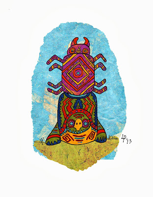
[Graphic by Artist: Samie Marc. Original Source Unknown.]
I found the process of working through this particular Phase of my Still Life Drawing Assignment simultaneously very challenging, very educational and very rewarding. Which is really what this whole Back To Basics Drawing Initiative is about! 100% About! I learned how to manipulate a particular drawing medium I had not previously used hardly before in my artistic career. I only used Scratch board once in college then never looked at it again, until a couple of months ago when I decided that the first piece of my new illustration portfolio would be done in scratch board. I wanted to use the Still Life exercises to help me re-familiarize myself with the medium and truly learn how to work with it successfully. I believe I have done that. I'm by no means the Master of the medium, but I feel confident and competent enough to work with it on a regular basis for my personal work and work I do for other clients. It will never be my signature or got to medium, but I fell it certainly is a very lovely feather in my cap.
My goals with these drawings I am sharing today were to focus on creating texture and value to render an object/subject in the most realistic way possible using scratch board. I really wanted to create a variety of believable TEXTURES and created a realistic dimensional space primarily with the use of VALUE. The process for creating each still life drawing was Identical. Before I tore down the Massive Still Life that was taking over my studio between November of last year to January/February of this year, I enrolled the help of my sweet and talented partner, B. I sketched out thumbnail Compositions of the Sections of the Still Life that I wanted to specifically draw. Each Composition focused on a different section of the Still Life which focused on a different texture of a featured object. B then photographed them. They were amazing photos because B is a very talented photographer. We took these photos at a Very High resolution so that I could zoom in on the computer when I was drawing very intricate details of each still life. We made the photographs Black and White and kicked up the contrast in them. This would make certain that the focus of each drawing would be creating contrast through creating good values in the drawing. I used my researched techniques and began to work counter intuitively from the drawing process of Phase One. I am now working from dark to lightest light, whereas Phase One you start with your lightest light and work to your deepest dark value.
In other words... the technique of Chiaroscuro.

[Thanks Wikipedia]
I'm basically going to go 1 by 1 with each drawing, starting from the first, and discuss the relevance of each one to this exercise. Ill talk about what I felt was successful and what I didn't. I'm going to include the photograph each was drawn from for a comparison.

Still Life DRAWING #1: Tea & Checkers with Grouch Marx.
The things I love most about this drawing are the textures of the Wicker Fedora and the Woven Checker Board. I really think I grasped the techniques I learned in my study of the medium.


I was very pleased with this second still life in this series. One of the most challenging thing about this was drawing an open umbrella on it's side and making the perspective work for it. The second challenge was to pack in a lot of detail. As this composition displays most of the still life that was put together, it encompassed a large number of objects, textures, proportion and spacial relationships. I think some of the more successful textures were the


I am VERY VERY VERY VERY Pleased with the outcome of this drawing. I want to say that out of the entire series, it might be the most successful in meeting the goals of the assignment as well as being my favorite... and not because it's the drawing where I got to draw my Harry Potter scarf. lol
I really feel that I NAILED the texture in the fabrics, both the scarf and the draped fabric behind the sculpture. I also feel that the carpet is a much better and more successful "carpet-like" texture this time round.


This still life drawing was also meant to show a more broad scope of the still life that I set up. It included more objects and really showed alot of the drapery that was behind it. It was also meant to focus of the texture of the very soft fur that is on the Stuffed Hare. I admit that out of all the drawings done in this series, this on is definitely the Weakest and Most Poorly Executed.


I really feel that this drawing was also VERY successful for this assignment. I felt the techniques I chose to render the objects in the drawing just seemed to work well and the balance of textures just kind of brought it all together. I LOVE LOVE LOVE how the shoes turned out... I thought that trying to render leather shoes in scratch board would be the challenge on this one. Also the wooden keepsake box was another challenge as I needed to show the wood grain texture.


Still Life DRAWING #6: RumTum's Cabana.
The entire time I was drawing this still life, and I know I mentioned this previously in the last Still Life Post, RumTum (my cat) would just make herself comfortable and lay down under the umbrella and prop herself up on the pillow and sleep while I drew the still life. So I wanted, if I could, to draw her in her little personal cabana. The focus of this drawing would be to try and simulate the texture of fur. I feel that it is not a bad attempt at the challenge, but it could definitely be better.

In conclusion, I VERY MUCH enjoyed etching into scratch board for these 6 somewhat consecutive drawings. As you know this project has spanned from last November and is FINALLY reached it's Conclusion. I am VERY Happy about this as I am now FREE to move forward with other things. This is really why Ben & Jerry needed to share in the small milestone of this year and bask in the completion (for now) of Back to Basics Still Life Drawing Initiative. I really feel that I have a good grasp on working with and balancing the contrasts of my values and textures. The re-visit to working exclusively with those particular Elements of Design was very nice to experience. I look forward to creating a couple of NEW Portfolio pieces in Black and White mediums. :0) I will, of course, share those with you as they are completed.
until next time...
Keep sketching, keep thinking, keep laughing and most important of all, keep making art.
Cheers,
LEWIS

Comments
Post a Comment